


Games
Interactive

Logos and Brands
Adobe Creative Jam
Books
Lettering

Personal Identity
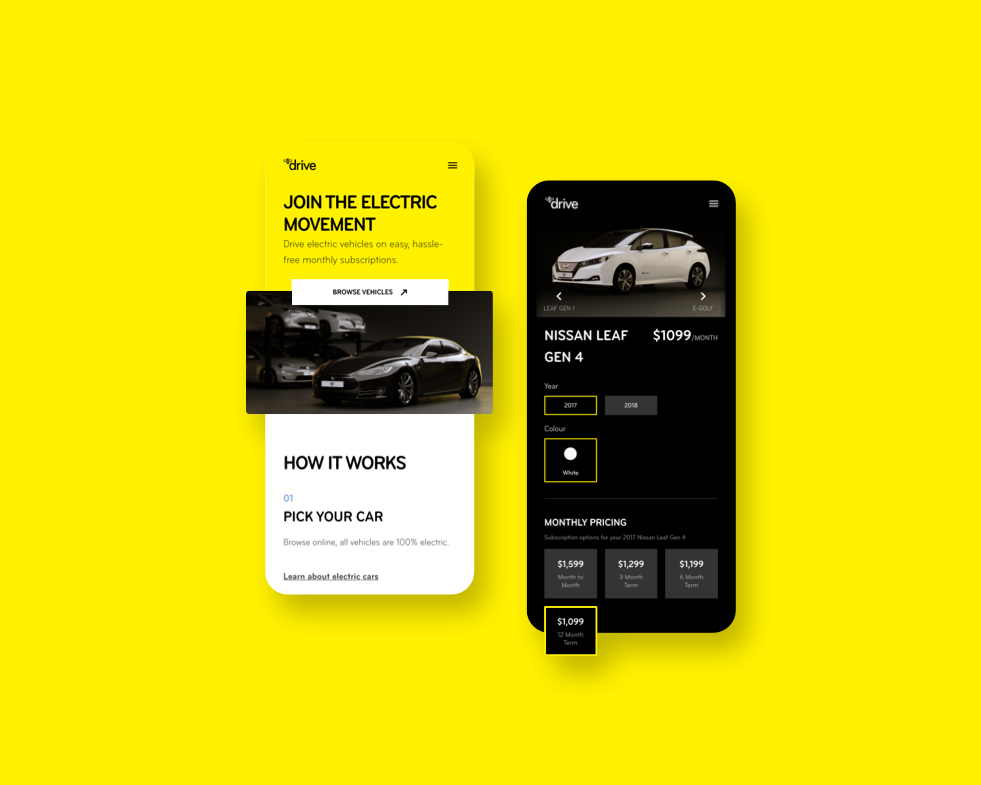
Apps
Illustration

Experimental